


14.
RAD Components
CodeWarrior's rapid application development (RAD) tools use components to build an application's user interface. These components address specific elements of the interface, such as buttons, scroll bars, and checkboxes. This chapter describes the components supplied with the CodeWarrior RAD tools.
This chapter discusses the following:
Java AWT Components

Table 14.1 describes the components that belong to the Java AWT Components catalog. The icons shown in the following table are displayed in the Component Palette and Component Catalog window.
Table 14.1 Java AWT components
Java Swing Components
Table 14.2 describes the components that belong to the Java Swing Components catalog. Many of these components are similar to those in the AWT Components catalog, but are more extensively configurable. The icons shown in the following table are displayed in the Component Palette and Component Catalog window.
Table 14.2 Java Swing components
Component Editors
Certain components display representative icons of the user interface, rather than the actual interface. These representative icons appear in the layout window only, and are not displayed in the application. Such components require separate editors to modify the way they are displayed in the application.
For example, the Java AWT MenuBar component produces a square icon in the layout window. This icon does not show the menu bar as it would appear in the application. Instead, you double-click the icon to open the Menu editor. The editor shows the true form of the menu bar.
This section describes the various component editors in the catalogs supplied with the CodeWarrior IDE. These editors include:
Figure 14.1 A Menu editor

Menu Editor
The Menu editor lets you create and modify an application's menu bar and its associated hierarchy of menu commands. This editor displays the menu bar onscreen so that you can see the menus as they appear in the application.
Double-click the representative icon in the layout window to display the Menu editor. Initially, the display is blank, as shown in Figure 14.1. As you build the menu hierarchy, the Menu editor updates the display to reflect your changes.
This section discusses the following topics:
Creating menu items
To create a menu item in the application's menu bar, double-click the rectangular outline shown in the Menu editor. A dialog box displays to help you customize a new menu item. The contents of the dialog box depend on the catalog that contains the component. For example, when you use the Menu editor to customize a Java Swing menu bar, the dialog box has the items shown in Figure 14.2.
Figure 14.2 Menu editor dialog box for Java Swing menu items

After you enter some information in the dialog box and click OK, the Menu editor updates the menu-bar display. For example, if you enter File in the Text field of the dialog box and click OK, the Menu editor display shows the new File menu item in the menu bar. The rectangular outline moves to the right of the File menu item.
Modifying menu items
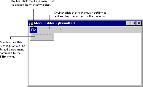
You can continue modifying your application's menu bar by double-clicking existing menu items or by clicking rectangular outlines. For example, if you click the File menu item shown in Figure 14.3, the Menu editor displays a rectangular outline beneath the File menu. This way, you modify the commands that are displayed for each menu item in the menu bar.
Figure 14.3 A Menu editor with modified menu items
When you finish modifying the menu bar, close the Menu editor window. Although the original representative icon appears in the layout window, your changes to the menu bar remain in place. To immediately save changes to the menu bar, choose Save from the File menu after closing the Menu editor window.
Removing menu items
To remove a particular menu item, click its name in the Menu editor window and press Delete. The Menu Editor removes the menu item and updates the display. Removing a menu item from the menu bar also removes that menu item's associated commands.
 NOTE
NOTE
When removing menu items from the menu bar, you might need to close and then re-open the Menu editor to accurately reflect your changes.
Pop-up Menu Editor
The Pop-up Menu editor is very similar to the Menu editor in its behavior. The only difference between the two editors is that the Pop-up menu editor handles one pop-up menu at a time. Figure 14.4 shows the initial display of a Pop-up menu editor.
Figure 14.4 A Pop-up menu editor

For more information about creating, modifying, and removing menu items in the Pop-up Menu editor, consult "Menu Editor" on page 553. The same techniques you use in the Menu Editor can be applied to the Pop-up Menu editor.
Visit the Metrowerks website at: http://www.metrowerks.com
For assistance contact Metrowerks Technical Support at: support@metrowerks.com
Copyright © 1999, Metrowerks Corp. All rights reserved.
Last updated: May 24, 1999


